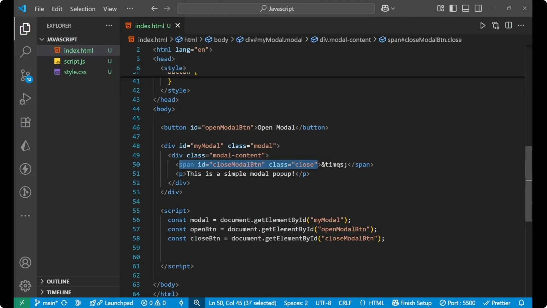
I am going to build a simple JavaScript modal popup. There is a button that opens the modal, a div that shows the pop-up content, and inside it a close span with the × symbol and a paragraph that reads Simple modal pop-up.
HTML for JavaScript Modal Popup
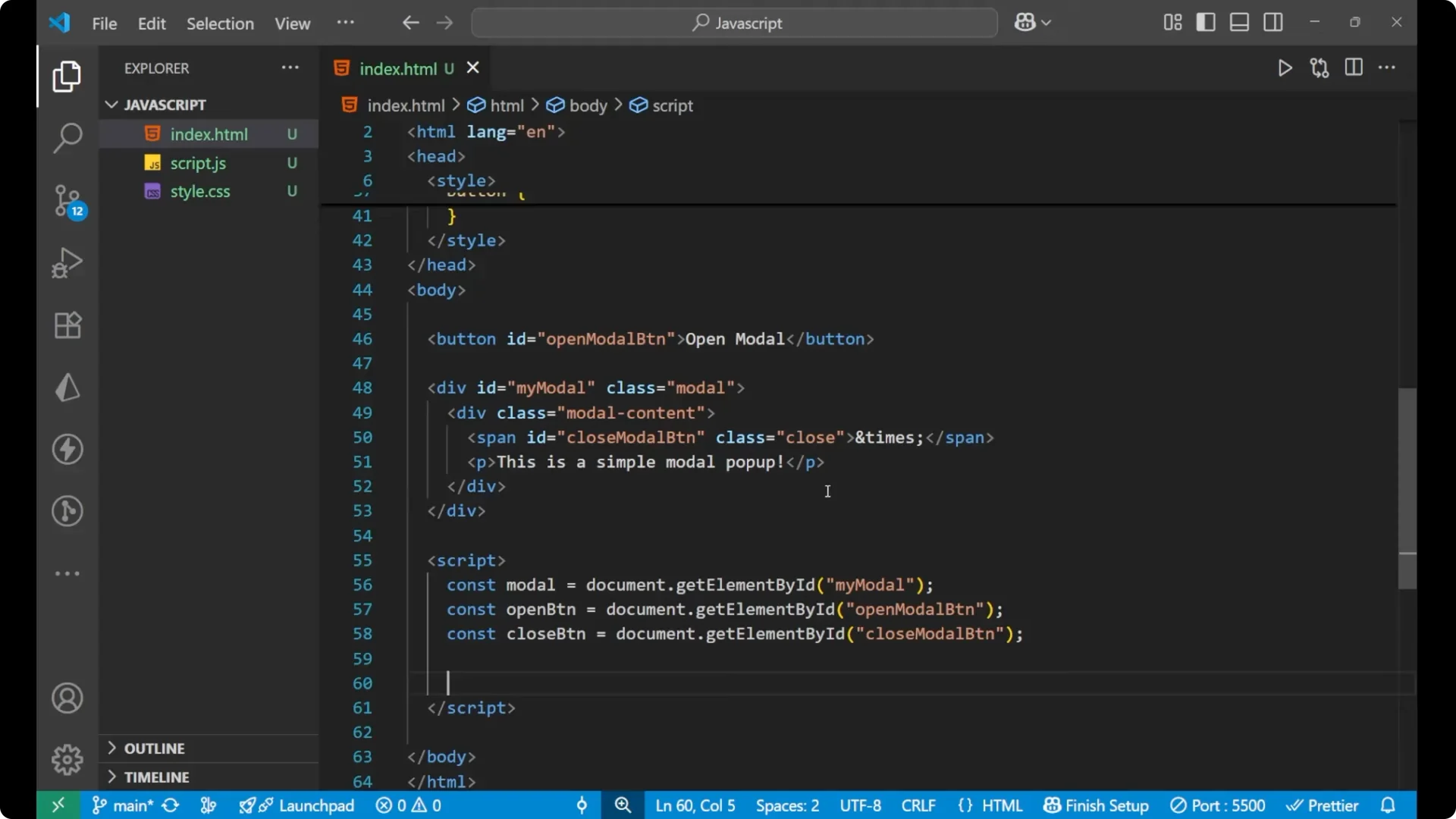
Here is the basic HTML for the page. The main modal container has id `myModal` and class `modal`.
Inside it there is a child div with class `modal-content` that holds a span for close and a paragraph for the modal text. The button with id `openModal` opens the modal.
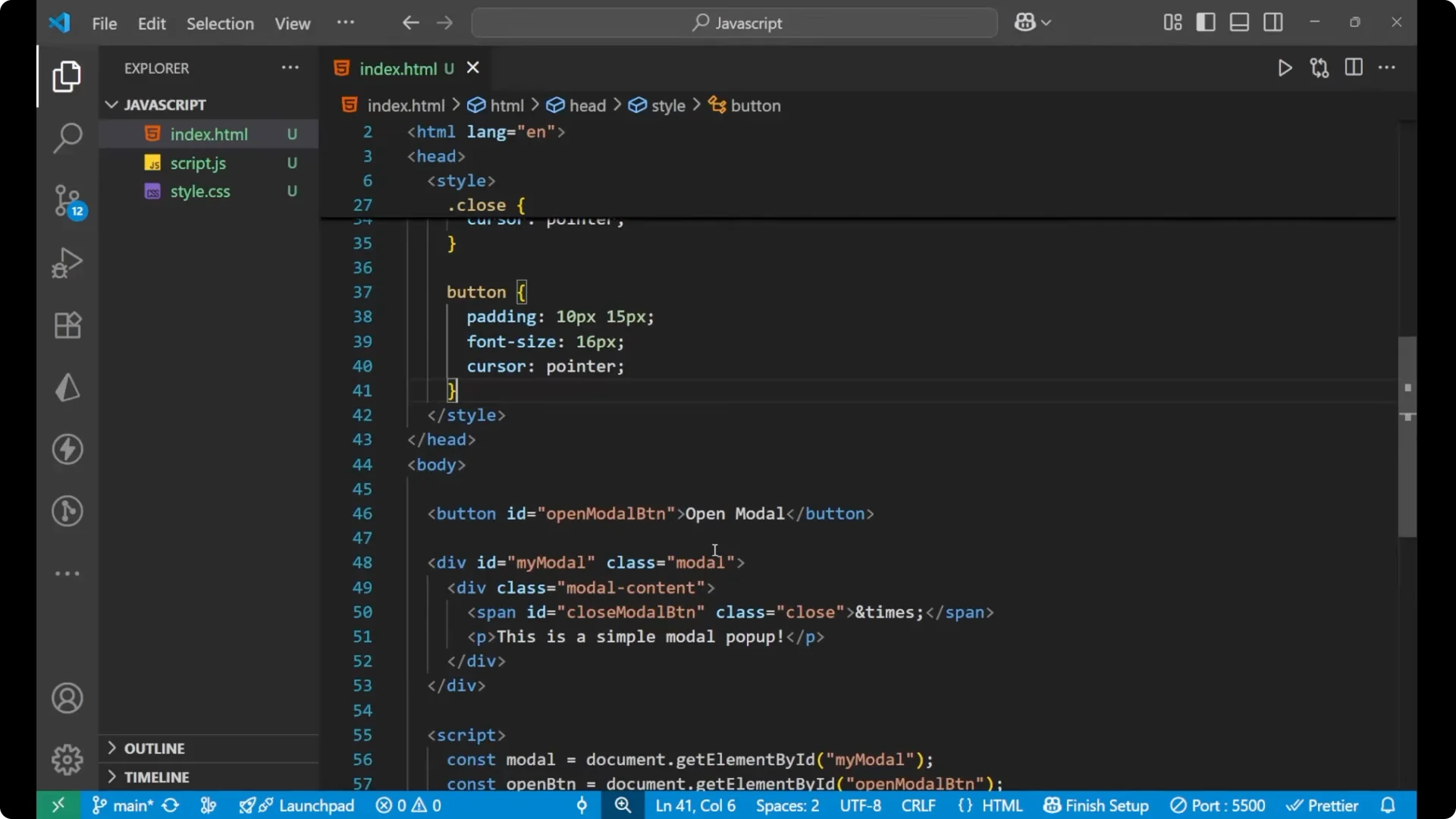
<button id="openModal">Open Modal</button>
<div id="myModal" class="modal">
<div class="modal-content">
<span class="close">×</span>
<p>Simple modal pop-up</p>
</div>
</div>
CSS for JavaScript Modal Popup
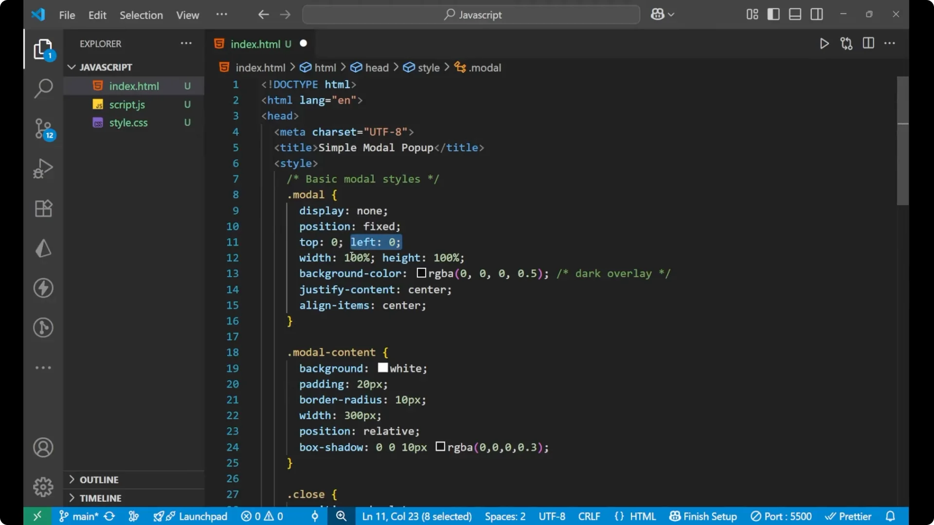
The `.modal` rules target the overlay container. I set display to none so it is not visible on initial load. The position is fixed with top and left at 0, and the width is 100% with height 100%.
The background adds a light overlay so the website behind looks a bit dull when the modal pops up. I use justify-content: center and align-items: center to place the content in the center.
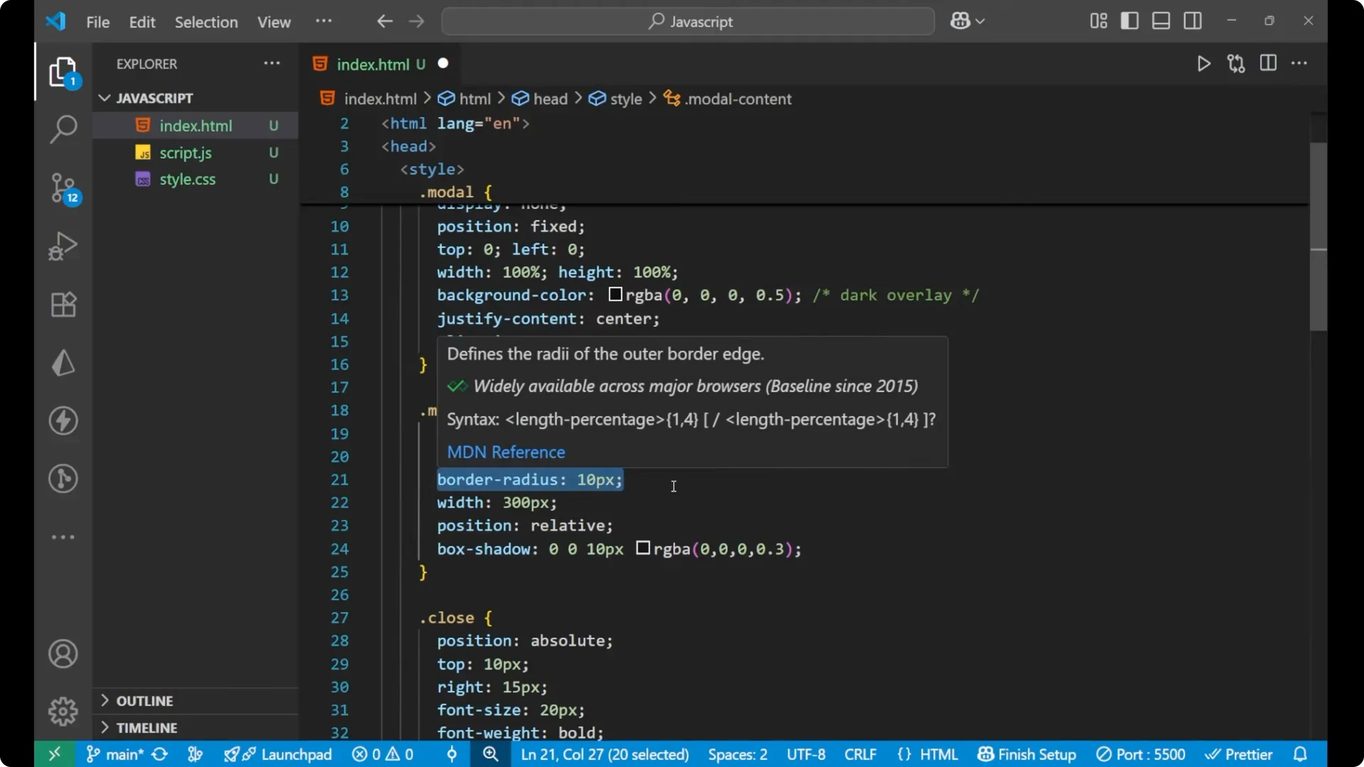
The `.modal-content` styles set a white background, padding of 20px, a 10px border radius, a width of 300px, position set to relative, and a soft box shadow.
The close span is absolutely positioned at the top right with a pointer cursor.
The open button gets simple padding, font size, and a pointer cursor.
.modal {
  display: none;
  position: fixed;
  top: 0;
  left: 0;
  width: 100%;
  height: 100%;
  background: rgba(0, 0, 0, 0.4);
  justify-content: center;
  align-items: center;
}
.modal-content {
  background: #fff;
  padding: 20px;
  border-radius: 10px;
  width: 300px;
  position: relative;
  box-shadow: 0 0 10px rgba(0, 0, 0, 0.2);
}
.close {
  position: absolute;
  top: 10px;
  right: 15px;
  font-size: 20px;
  font-weight: 700;
  color: #333;
  cursor: pointer;
}
#openModal {
  padding: 10px 16px;
  font-size: 16px;
  cursor: pointer;
}
JavaScript Modal Popup functionality
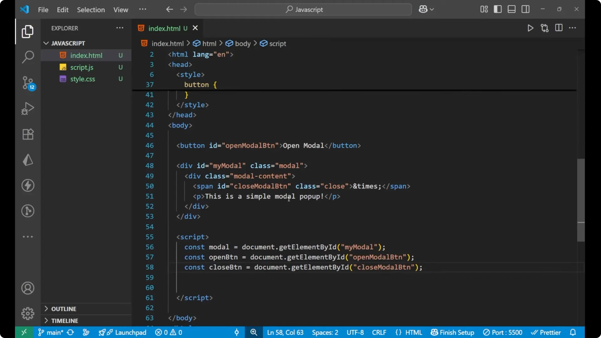
For the functionality I grab three elements inside a script tag: the modal div, the open button, and the close button span.
const modal = document.getElementById('myModal');
const openButton = document.getElementById('openModal');
const closeButton = document.querySelector('.close');
Open and center
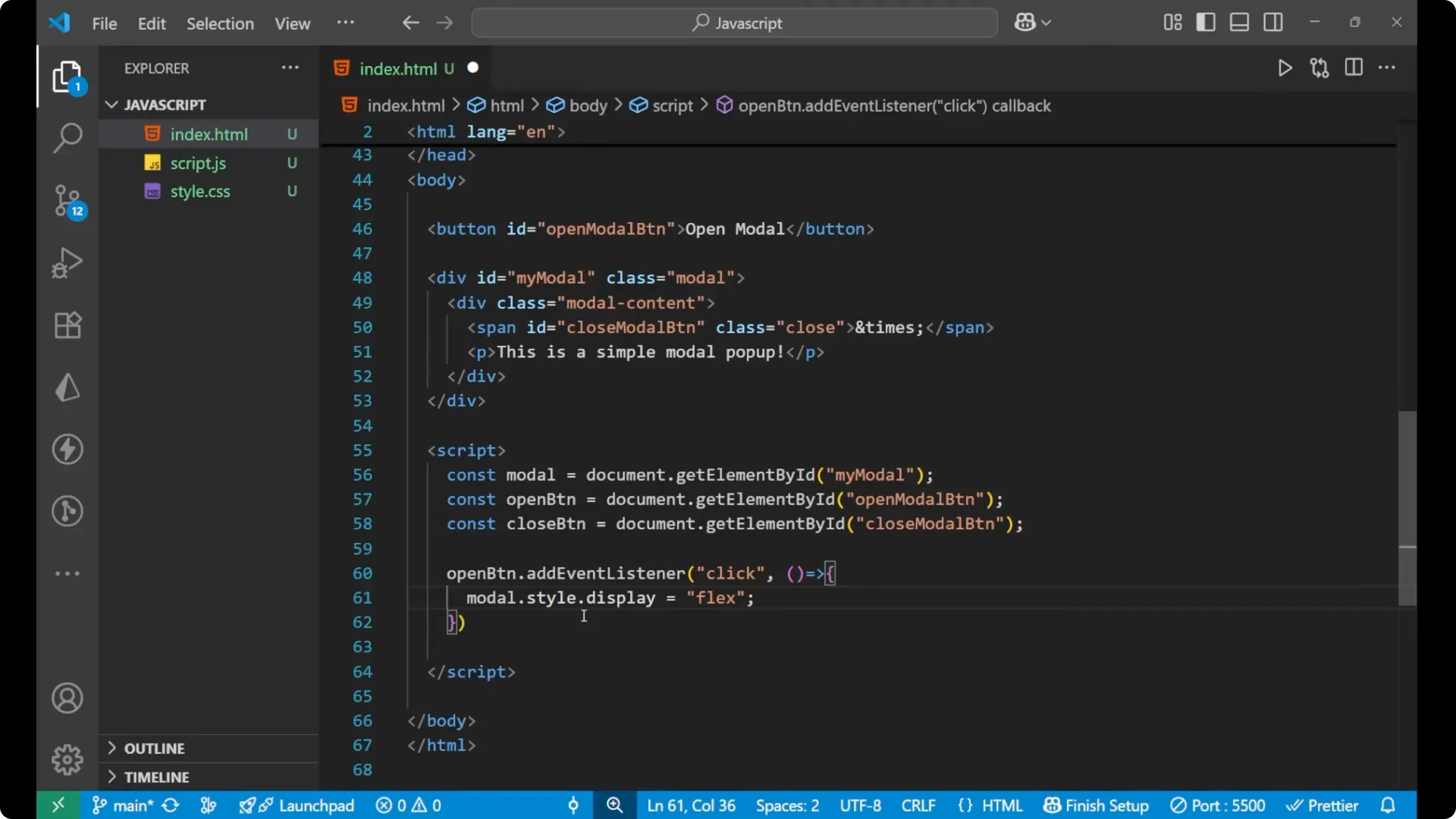
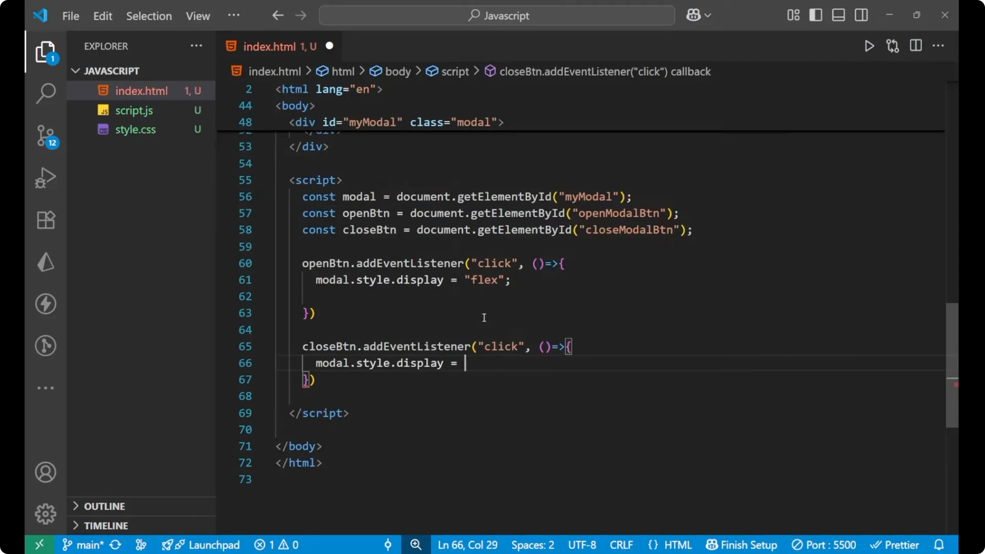
I add a click event listener to the open button. When clicked I set `modal.style.display = ‘flex’`.
I set it to flex so that the earlier display: none is removed and the content comes to the center using the justify-content and align-items properties.
openButton.addEventListener('click', () => {
  modal.style.display = 'flex';
});
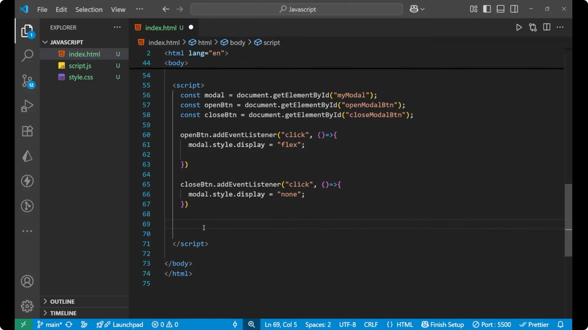
Close actions
I add a click event listener to the close span. In this function I set `modal.style.display = null`.
closeButton.addEventListener('click', () => {
  modal.style.display = null;
});
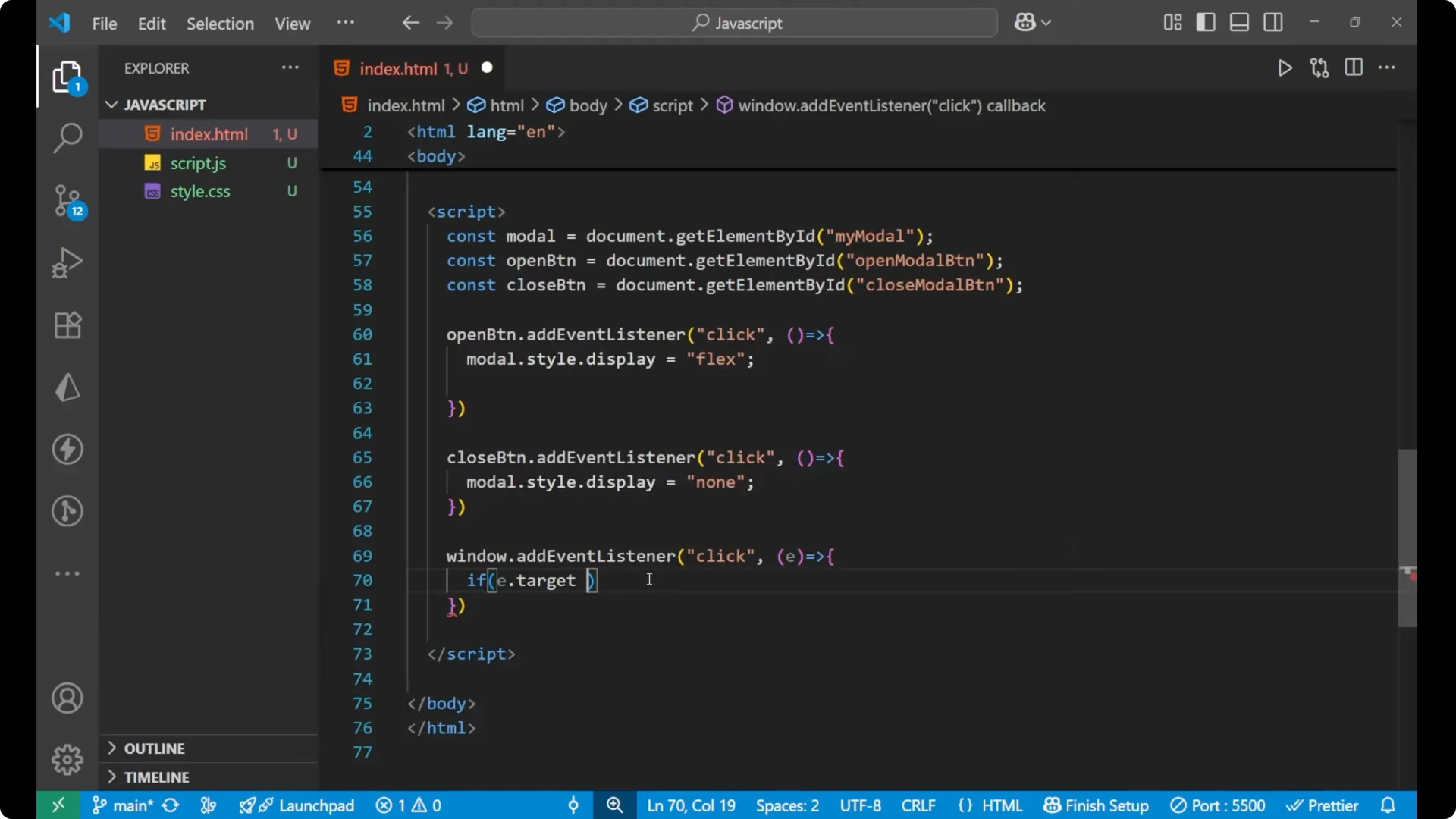
Click outside to close
I add one more important event for a better user experience.
I listen for clicks on the window and check if the click target is the modal overlay. If `e.target === modal`, I set `modal.style.display = ‘none’`.
Since the modal has 100% width and height, clicking outside the content but within the overlay closes it.
window.addEventListener('click', (e) => {
  if (e.target === modal) {
    modal.style.display = 'none';
  }
});
Click the Open Modal button and the popup appears centered with the dimmed background.
Click anywhere on the overlay and the popup is removed.
Click the cross button and it disappears.
Final Thoughts
This is how I created a simple JavaScript modal popup with a centered content area, an overlay that dims the page, a close button, and a click-outside-to-close behavior. The key is toggling the modal container’s display between none and flex so the centering rules apply when it is visible.